"Race to 270" is back!
I dug up my old code a couple weeks ago, and, after a thorough re-write, I'm back to making predictions. Lessons learned:
- Always comment your code. No matter how obvious something seems when you write it, it's not going to make any sense three to four years later. Once I do comment my current code, I'll post it somewhere.
- I was handling the exceptional cases of Maine and Nebraska in a really dumb way back in 2004 (I honestly can't quite figure out what I was doing, but it looks really dumb), and now I'm handling those cases in a way that fits much better into the theoretic framework I'm using. As a side-effect of understanding this better, I also know how to incorporate data from nation-wide polls into this analysis.
- My handmade cartograms are a little hokey and too time-consuming. I'd like to use slick Mapresso-made images (like in a recent post of mine to MyLeftNutmeg), but I'm having a surprising amount of trouble finding a shapefile of the 50 US states (let me know if you have one). Once I have this working, it'll be a lot easier for me to make maps quickly.
- Nobody has this 2008 election in the bag. It might turn out to be a nailbiter, or it might not; but anybody who says they know what'll happen is full of it.
- The technique I use right now deals well with two sources of error: sample error (i.e., the fact that each poll only surveys a small number of people), and the fact that popular opinion changes over time, so that an old poll has less information now than when it was taken. There's another source of error that I'm not catching yet: Some percentage of people in each poll are undecided, and it's unclear how they would actually swing. I have some ideas about how to handle this, but so far I keep calculating into variance matrices that fail to be positive definite. Ouch--I clearly need to think about this issue more.
- Another problem I'm having is best described by this simplified situation: A nation is divided into two parts, X and Y. Two polls come out with low alleged margin s-of-error. A poll in part X shows a 5% decline for the Democratic candidate, a national poll shows a 1% decline for the Democratic candidate, and there is no poll in part B. The algorithm will then infer that the Democratic candidate has gained somewhat in part Y. This is the right thing if the pollsters' margins-of-error are accurate and the input correlations between states are correct. However, some weird results (for example, Obama doing worse in Florida than in Georgia) are coming up with my current assumptions, so I think I'm going to have to increase my assumed correlations between states.
So far I've only had time to input data for one candidate pair. I've chosen Obama vs. McCain since they're leading their respective races both in delegates and on the major betting websites. All the probabilities here should be considered conditional on those two candidates winning their nominations.
Another note: Since Democrats now control a majority of state delegations in the House, I now consider a 269-269 tie to be a Democratic victory. There is less than a 1% chance of this happening.
Stats and Maps
If the election were today...
- Probability of victory: 52% +- 1%.
- Expected number of electoral votes: 269 +- 3.
- Expected popular vote: 49% +- 1%.
- Break-even popular vote: Unknown, but probably around 48%. (This means the popular vote margin at which both candidates have an equal chance of victory. I haven't written the small amount of code necessary to measure this, but it should be easy to do.)
- Swing states (measured by correlation between the winner in the state and the winner nationally):
- OH 67%
- PA 65%
- MO 48%
- FL 41%
- NJ 38%
- WI 35%
- AR 30%
- ME-2 26%
- NV 24%
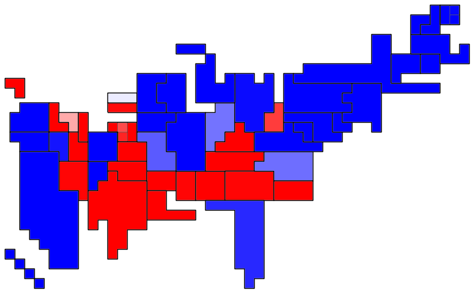
- Electoral vote distribution (electoral votes vs. probability):

- Confidence map (states sized by electoral vote, darker red means higher confidence that McCain will win, darker green for Obama):

- Expected vote map (darker red means more votes for McCain, darker green for Obama):

Map Key

posted by Benjamin Schak at 1:04 PM
![]()

0 Comments:
Post a Comment
<< Home